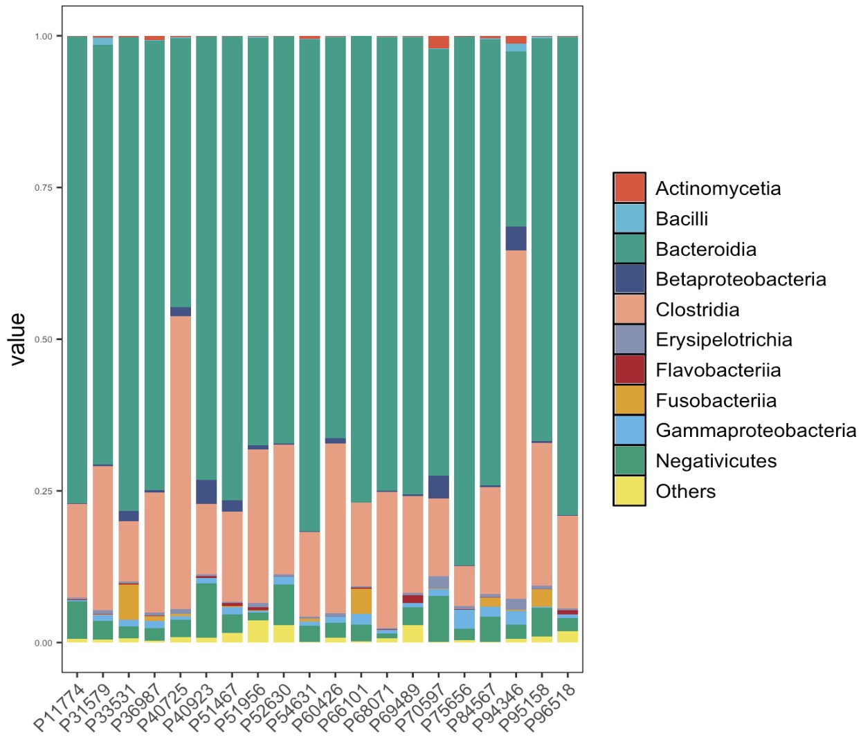
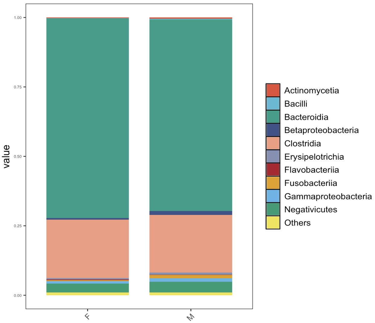
8.9 EMP_structure_plot
The structure diagram is mainly used to show the top features in the data. For example, in microbiome data, the relative abundance of the top 10 species can be used to show the main composition of microorganisms.
8.9.1 For microbial data
Note:
①The inside palette provides 15 colors for top features. To plot more features, users need set more color by the parameter
②The parameter
①The inside palette provides 15 colors for top features. To plot more features, users need set more color by the parameter
palette.
②The parameter
method can select the top features by mean, median, max, and min method.
🏷️Example 1:Plot the Top 10 taxa with relative abundance at Class level.
MAE |>
  EMP_assay_extract('taxonomy') |>
  EMP_decostand(method = 'relative') |>
  EMP_collapse(estimate_group = 'Class',collapse_by = 'row') |>
  EMP_structure_plot(top_num=10)
🏷️Example 2:Plot the top 10 taxa based on group.
MAE |>
  EMP_assay_extract('taxonomy') |>
  EMP_decostand(method = 'relative') |>
  EMP_collapse(estimate_group = 'Class',collapse_by = 'row') |>
  EMP_structure_plot(top_num=10,estimate_group='Group')

🏷️Example 3: Plot the top 10 taxa with relative abundance at Class level based on Sex group.
MAE |>
  EMP_assay_extract('taxonomy') |>
  EMP_collapse(estimate_group = 'Sex',collapse_by = 'col') |>
  EMP_decostand(method = 'relative') |>
  EMP_collapse(estimate_group = 'Class',collapse_by = 'row') |>
  EMP_structure_plot(top_num=10)
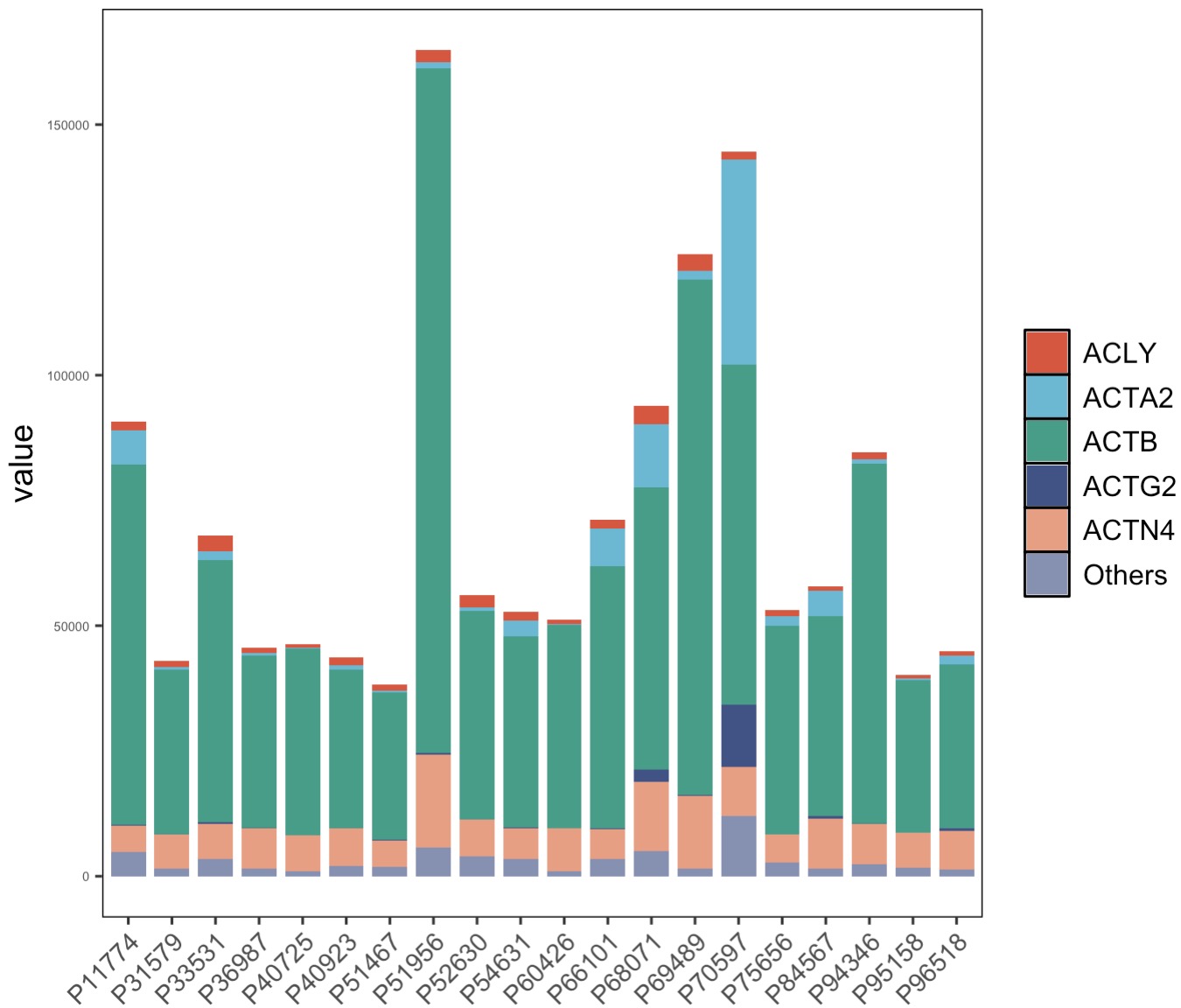
8.9.2 For genomics data
The structure diagram can be used to show the distribution of top genomic features.
🏷️Example:Plot the top 10 genes after difference analysis.
MAE |>
  EMP_assay_extract('host_gene') |>
  EMP_diff_analysis(method = 'deseq2',.formula = ~Group) |>
  EMP_filter(feature_condition = pvalue < 0.05) |>
  EMP_structure_plot(top_num=5)